THE SECRET ICE CREAM SOCIETY
- BRANDING + IDENTITY
- PACKAGING DESIGN
- ART DIRECTION + BRAND STRATEGY
- WEBSITE DESIGN + MARKETING
This project involved developing the complete brand identity for an artisanal gelato shop that specializes in unexpected and intriguing flavor combinations. The core concept revolved around the idea of a "Mystery Gelato Society," a clandestine group of connoisseurs who crave the thrill of discovering unique and surprising flavor experiences.
BRANDING
The brand identity is built around the concept of dynamic duos. The logomark features a playful juxtaposition of typefaces – This concept of pairing is further explored throughout the brand identity, with unexpected color combinations, playful type treatments, and intriguing flavor pairings.


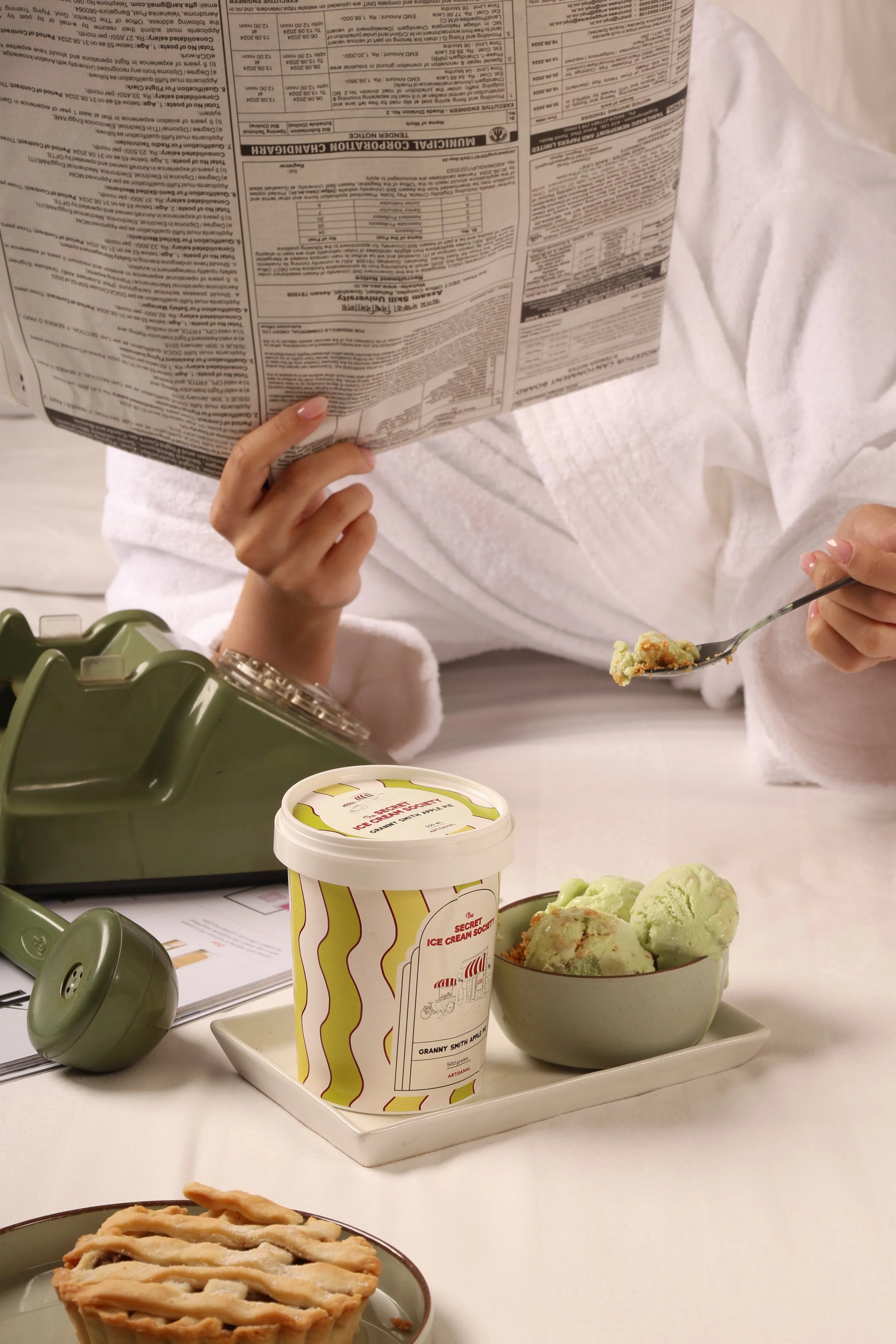
PACKAGING
The packaging design mirrors the brand's playful and intriguing personality. We wanted to use bold colors and playful patterns to create a sense of excitement and anticipation. The typography is clean and modern, with a touch of whimsy.


WEBSITE
We wanted to pair rich visuals with minimalistic typography to create a seamless user experience. The overall color scheme is fresh and playful, reflecting our brand’s essence. The balance of aesthetics and functionality was important to us, so we focused on responsive design and imagery that feels like an exploration for our users - to dive into our world of innovation and indulgence.

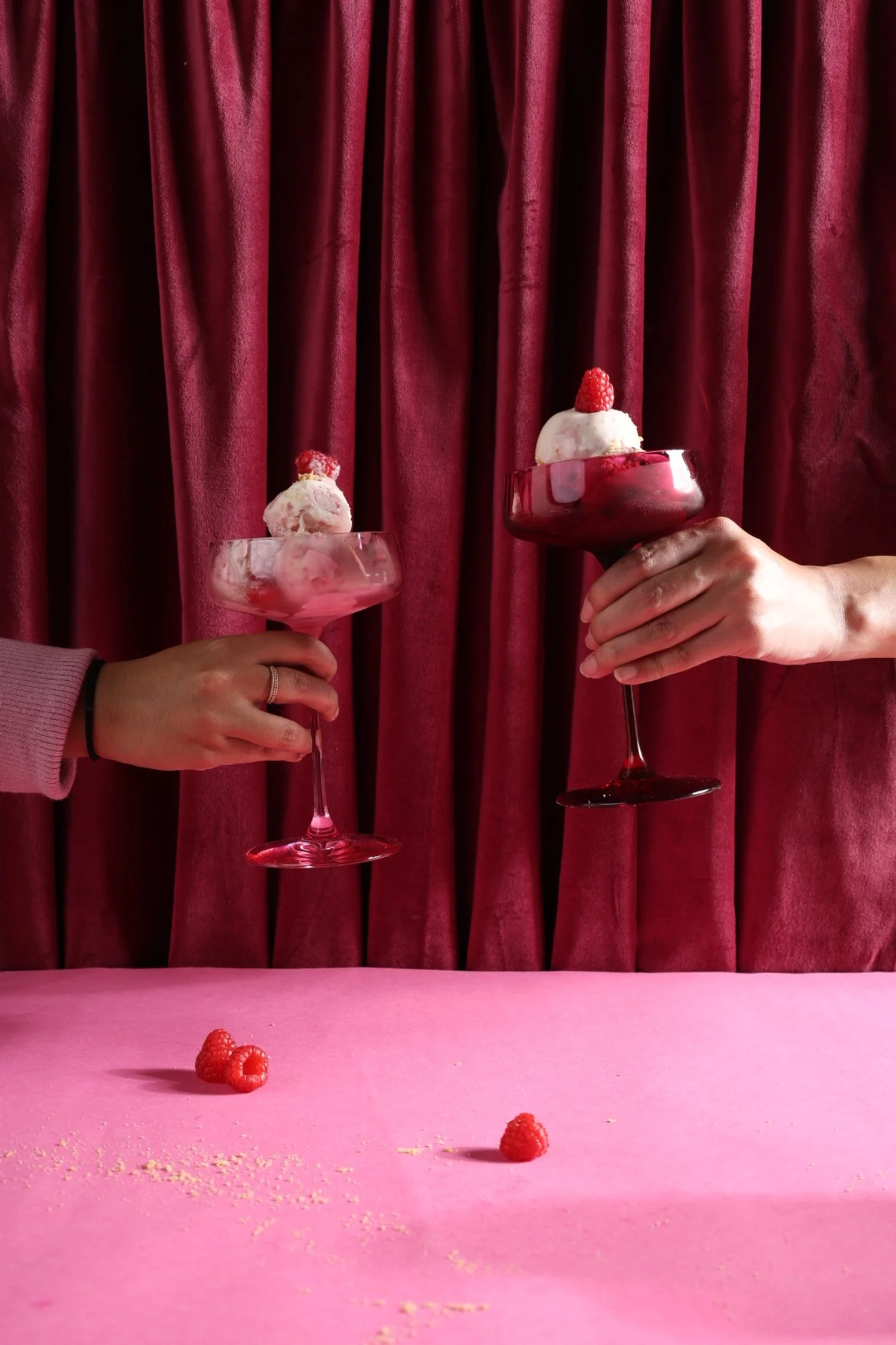
ART DIRECTION
Career highlight: Gelato-induced happiness.
Quirky, playful and lifestyle focused.
For the art direction, we took a photography-first approach, mixing quirky compositions with a natural lifestyle feel. The imagery highlights the ingredients—making them the heroes of the story.